

When a stock and markets starts moving quickly, investors often want more information than the latest price. Has trading volume increased? Where did buyers previously step in? Is the move unusual for this particular stock? Advanced charting tools make it easier to examine what is happening and compare current activity with earlier trading.
This can be particularly useful with volatile or heavily watched stocks, where prices can change quickly following company news or a sudden increase in investor attention. Instead of relying on a basic quote screen, investors can use charts to see how a move developed and decide whether it warrants further research.
What Makes a Charting Tool Advanced?
A basic stock chart usually provides price history and little else. More advanced platforms offer drawing tools and custom timeframes, while features such as watchlists and alerts help investors keep track of stocks they are following.
Platforms like TradingView help investors identify important price areas and save chart layouts that suit the way they follow the market. Changing the timeframe can be particularly useful when a stock is moving quickly. A daily chart provides a broader view, whereas a shorter timeframe shows what has happened during the current trading session.
That extra context can make a noticeable difference when a small-cap stock begins moving after a headline. Investors can see how quickly the move developed and whether trading activity changed at the same time.
Indicators Need Context To Be Useful
Once the price movement is clear, indicators can provide additional information. They are better treated as tools for interpretation than as instructions to buy or sell.
A moving average, for example, can make the direction of a longer trend easier to see. An investor concerned about whether a recent move has become unusually extended might also look at a momentum indicator such as RSI. For shorter-term activity, measures such as VWAP can show how the current price compares with trading earlier in the session.
Price levels matter too. If buyers have repeatedly appeared around a particular area, investors may continue watching that level when the stock returns to it. Previous highs can be equally relevant because they show where an earlier rally struggled to continue.
None of this determines what a stock will do next. Instead, these tools provide context for the price currently displayed on the screen.
Volume Can Change How a Price Move Looks
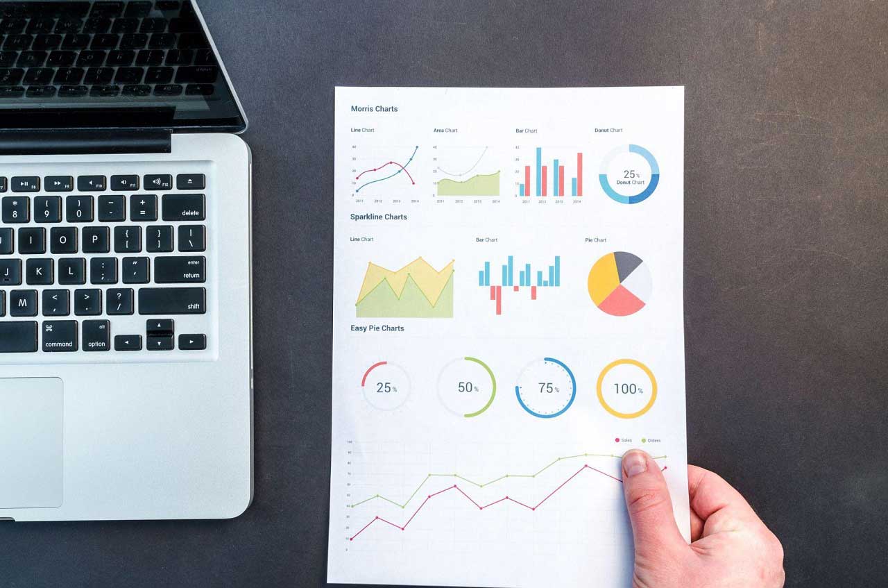
Price becomes more informative when it is viewed alongside trading activity. A stock might appear to be breaking above a previous high, but it is also worth checking how much trading is taking place as it moves through that level.
This becomes especially relevant in thinly traded or low-float stocks. Sharp moves can occur when relatively few shares are available, so an impressive-looking chart may not reflect the conditions an investor encounters when attempting to trade.
Liquidity matters for the same reason. Wide bid-ask spreads can make entering or leaving a position more difficult than the chart suggests. Investors following smaller companies may therefore pay close attention to how actively a stock is trading rather than assuming every sudden price spike carries the same significance.

The Right Timeframe Depends on What You Are Watching
The usefulness of a chart also depends on the timeframe being viewed. Someone following activity during the trading day may want to see what has happened over the previous few minutes or hours. An investor interested in the broader direction of a company may get more value from daily or weekly charts.
Checking another timeframe can prevent a short-term move from dominating the picture. A stock may appear strong during one session while approaching a price area where an earlier rally stalled.
Moving between shorter and longer views shows how the latest activity fits into the stock's wider history. Looking at both can help when attention around a company suddenly increases and short-term trading becomes more volatile.
Charts Cannot Explain Why a Stock Is Moving
Technical tools show how the market is behaving, but investors still need to establish what is behind the activity.
An earnings release or SEC filing can quickly change how a chart should be interpreted. The same applies to a company announcement. Sometimes the explanation sits outside the company itself, particularly when news affecting an industry causes several related stocks to move at once.
This is especially relevant for stocks attracting attention on investor forums and message boards. A company might move above a closely watched price level on heavy volume in the morning, only for the situation to change once investors have had time to examine the news behind it.
Charts are therefore more useful when they sit alongside basic due diligence. Checking current company information helps investors understand whether there is a clear development behind the activity or whether attention itself is contributing to the move.
Our Final Thoughts
Adding more features does not necessarily improve analysis. Once too many indicators are placed on the same chart, it can become harder to work out which information actually matters.
A simpler layout based on tools the investor understands may be more practical. It can also reduce the temptation to keep searching for a technical pattern that supports an existing opinion about a stock.
This matters with penny stocks and other highly volatile names, where price behavior can be noisy and apparent patterns may disappear quickly. Charts can organize market information, but uncertainty remains.
For investors, that is where advanced charting can be most useful. It provides a structured way to examine a move as it develops and compare it with previous trading. Combined with current company information and an understanding of trading conditions, a chart can make it easier to see what is actually happening before deciding whether a stock deserves further attention.