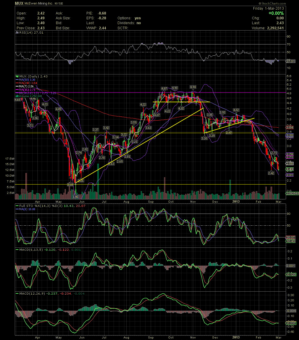
MUX Daily Chart............ The Bleeding Continues
Post# of 2561

MUX Daily Chart............ The Bleeding Continues
Prior to the start up of Investors Hangout, quite a few of my friends and I swing traded MUX successfully. I'm sharing this chart to show the importance of a few basic indicators and support/resistance lines, and how important it is to follow them and act on them when certain levels are broken. This chart covers the second half of 2012 to the present. While MUX was in an uptrend from late May into October, note the resistance at the 4.90 area. Also note the support in the 4.40s while the stock trended between the channel of those two price levels. Once that support was broken, the next potential support level was the rising trend line (diagonal yellow). See how quickly MUX fell when the various support lines were broken. To accompany those breaks, look at the FullSto and MACDs as they threw out sell signals when the greens crossed under the reds. It wasn't until mid November that these indicators reversed to a buy signal. At what level did that occur? Follow the horizontal yellow line back to the left of the chart to see where that line developed from bottoms and tops, or support and resistance points. A new rising trend began but when it was broken in early January, that should have been yet another warning sign. The break below the MA200 and the following break of the horizontal support just below 3.40 created the ensuing red waterfall. Most everyone I swing trade with is out of the stock until we see a bottom put in place. That could be here in the low 2.40s but could just as easily drop to the next horizontal support area of the 2.10s. There's no doubt MUX is currently very oversold, but attempting to catch a falling knife can slice one up. So I'm choosing to sit and wait until things become more clear.

 (0)
(0) (0)
(0)