Guess you STILL don't understand. Both MI and IL g
Post# of 65629
I'll rub your willfully ignorant nose in the following as often as you post pointless, fact-challenged slurs against the States that support Red State 'Murica.
And I'll leave you with this thought as well. If the data showed the exact reverse, that Red State America was sending it's tax dollars to a relatively impoverished and not particularly healthy Blue State population......you righty idiots would be screaming for secession.
Quote:
Which States Are Givers and Which Are Takers?
https://www.theatlantic.com/business/archive/...rs/361668/
What the resulting map shows is that the most “dependent states,” as measured by the composite score, are Mississippi and New Mexico, each of which gets back about $3 in federal spending for every dollar they send to the federal treasury in taxes. Alabama and Louisiana are close behind.
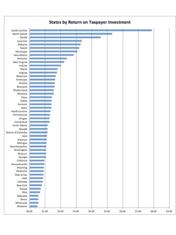
If you look only at the first measure—how much the federal government spends per person in each state compared with the amount its citizens pay in federal income taxes—other states stand out, particularly South Carolina: The Palmetto State receives $7.87 back from Washington for every $1 its citizens pay in federal tax. This bar chart, made from WalletHub's data, reveals the sharp discrepancies among states on that measure.

On the other side of this group, folks in 14 states, including Delaware, Minnesota, Illinois, Nebraska, and Ohio, get back less than $1 for each $1 they spend in taxes.
It’s not just that some states are getting way more in return for their federal tax dollars, but the disproportionate amount of federal aid that some states receive allows them to keep their own taxes artificially low. That's the argument WalletHub analysts make in their 2014 Report on Best and Worst States to Be a Taxpayer.
Another part of the explanation is easier to discern. The reddest states on that map at the top—Mississippi, Alabama, Louisiana, New Mexico, Maine—have exceptionally high poverty rates and thus receive disproportionately large shares of federal dollars.
Through a variety of social programs, the federal government disburses hundreds of billions of dollars each year to maintain a “safety net” intended to help the neediest among us.
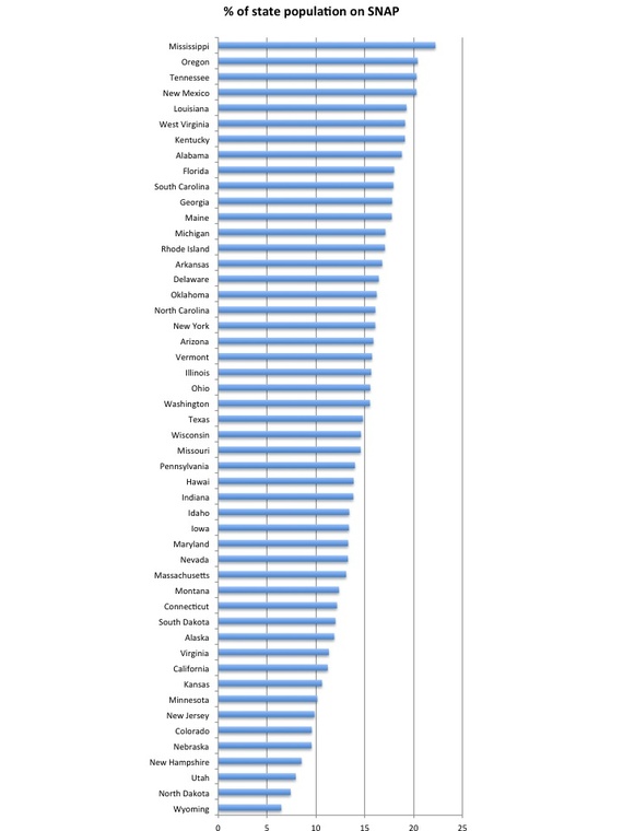
Consider, for example, the percentage of each state’s residents who get “food stamps” through the federal government’s SNAP program. This chart tells the story.

Number of People in State on Food Stamps (April 2014) / Population of State (2010)
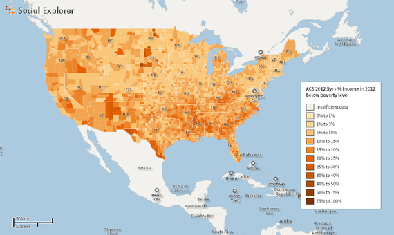
Another way of getting at the same point is to map the percentage of families in 2012 with incomes below the federal poverty level (according to the Census Bureau’s ACS five-year estimate).
This map, made through Social Explorer, shows the data at the county level: The darker the shading, the higher the percentage of impoverished residents.
https://www.socialexplorer.com/c0213d14ea/vie...flash=true

https://www.theatlantic.com/business/archive/...rs/361668/
 (2)
(2) (0)
(0)