(Total Views: 736)
Posted On: 02/13/2020 3:19:38 PM
Post# of 33173
SaaS Money Pits - Grinding The Data
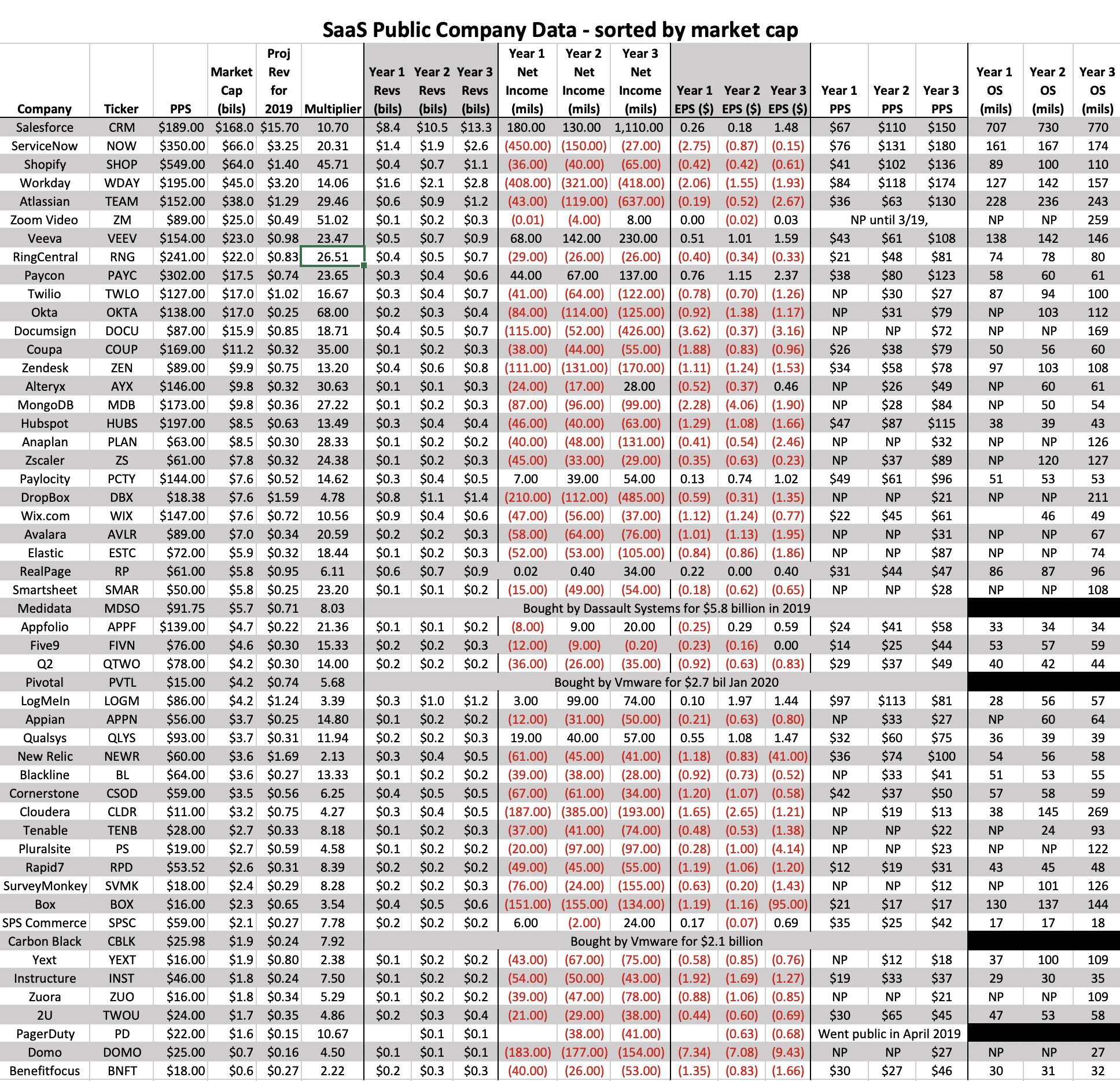
Been doing some data crunching to see just how much money SaaS companies are making, or losing as the case may be. Someone on here is a big proponent of facts. So I present the facts, Jack. Please see below or click the link for the updated spreadsheet. (The JPEG may be too small to read for some, so click the link to bring you to a larger shot of it.)
I took the list of companies from my spreadsheet I posted the other day and did a whole lotta diggin'. All the numbers are now current, whereas before they were from Sept 2019. I noticed many of their PPS's have increased substantially since the original. Seems SaaS is the place to be.
All the data is from each company's last 3 annual reports and Yahoo finance. Years may be different from company to company since they file at different times, so I called them Year 1, 2, and 3. I may have fat fingered something or misread it, so please remember the data is only worth what you paid to view it.
Some of the companies were not public until recently and did not have 3 years of data. "NP" means it was not public at that time.
New columns include:
- Revenues going back three years
- Net Income going back three years
- Earnings Per Share (EPS) going back three years
- Stock Price Per Share (PPS) around the time the annual report was filed
- Outstanding Shares (OS) going back three years
A few tidbits:
- These folks lose a crap ton of money! Everything in red with a parenthesis is a negative number. From the Net Income and EPS columns, we can see there are very few who are making money. In fact, for some, their losses get bigger each year.
- With all those loses, the general trends of these stocks must be down, right? Heck no! From the PPS columns we can see most have substantially gained over the past three years.
- Well, at least if they are losing all this money, they must be conserving their share structure and buying back shares, Wrong again! From the OS column we can see most every single one of these companies had more shares on the open market year over year due to offerings, options, grants, deals, etc.... And even while their OS is increasing, their stocks are still going through the roof.
- A good case study is Workday, which is 4th down on the list. Their PPS is around $195 today. They have a market cap of $45 billion, and afforded a multiplier of around 14. They have substantially increased revenues over the past 3 years. However, they have a staggering 9 figure loss in each of the 3 years and they lose more today than they did 3 years ago. However, their stock price has more than doubled. Lastly, if you look in the last columns, they have been steadily tossing around shares like it was birdseed. In fact, their OS increased over 25%.
Now that was an an example of a Large SaaS company, but go ahead and look at all of them and you will see very similar trends.
Lastly, I removed our dear Verb from the list as I said in my last post it is not a fair comparison. But the data backs up the fact that Verb is completely in the right market, that loses do not restrict PPS appreciation, and keeping a tight capital structure is not the thing to do when your PPS is through the roof and you are trying to grow and gain market share.
RIGHT PLACE, RIGHT PRODUCT, RIGHT PRICE...LIVE AND LEARN
https://investorshangout.com/images/MYImages/...2_Data.jpg


