Posted On: 10/07/2014 1:10:00 PM
Post# of 9904
Junior Gold Miners KEY Sectors To Watch In 2014
If gold miners got destroyed in 2013, junior gold miners got taken to the woodshed, obliterated, then eviscerated. You really can't find a more beaten up sector over the past 3 years. You can't find a sector that is more hated, where more pessimism and fear reign supreme. So if you're a contrarian, you should stand up and take notice.
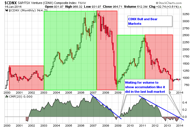
Here's something that you need to understand. Junior gold miners don't always just go down. In fact one of the biggest gains in any sector from its 2008 low to 2011 high was in the junior gold mining sector. The Canadian Venture Exchange gained 256% from its December 2008 bottom to its March 2011 top, a huge gain over a period of 27 months. The GDXJ junior gold ETF came out in late 2009. In 2010 it was one of the best performing ETFs in the market gaining about 67%. From its 2010 low to its 2011 high, a little over a year in duration, GDXJ was up over 100%. So the junior miners have experienced bull markets in the past. There's a saying that bear markets follow bull markets, and bull markets follow bear markets. For a great example of that checkout the history of the Canadian Venture Exchange. The chart below shows the major bear markets shaded in red, and the major bull markets shaded in green. If you notice after the 2008 bear market ended, an increase in buying pressure went on to produce the bull market from 2009-2011. That's what is missing currently as the Venture has built a base but buying pressure still hasn't shown up in full force.
Five Things To Notice While Gold Keeps Drifting
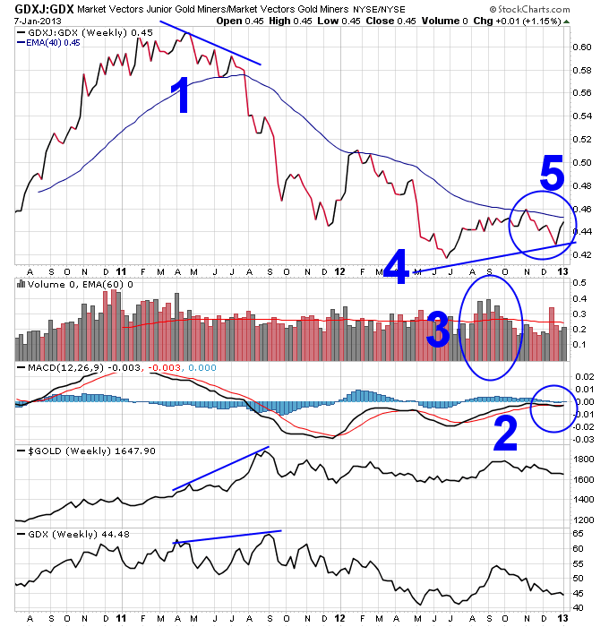
1. If you paid attention to the GDXJ to GDX ratio back in 2011, it gave you a 4-month heads up that something wasn't right in the gold sector. The ratio made a series of lower lows while major gold stocks continued higher, and the price of gold surged higher into a parabolic top. This divergence foretasted the bear market in gold and gold stocks that has followed to this day.
2. But now to the good stuff, first the MACD ratio here is actually trying to hold up and not roll over. It is also challenging the all important zero level, which tends to separate uptrends from downtrends.
3. This is the kind of volume increase you want to see coming off of a bottom. And the pullback since October has been on mostly lower volume.
4. Maybe the most important thing on this chart, this price divergence could be forecasting a new upleg in the gold sector if it holds up, just like the last major divergence forecasted a new major downleg in 2011.
5. I'd like to see this ratio break above the 30-week moving average and see another increase in volume to confirm a real breakout higher.
This is definitely a chart to keep an eye on if you're following the gold sector.
Coal Stocks Grinding Higher
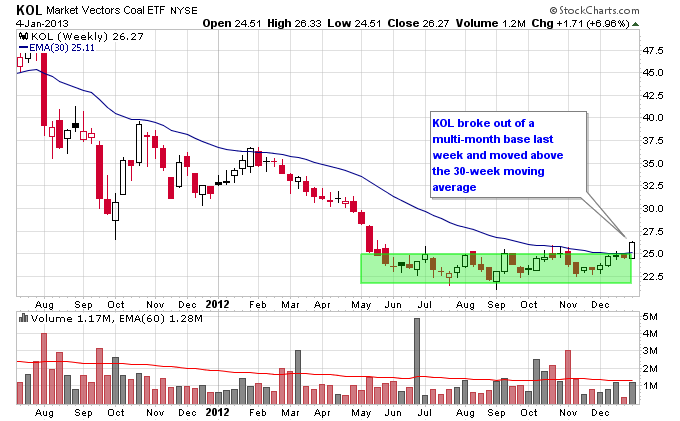
Coal stocks continue to steadily emerge from a brutal bear market over the past 2 years. Last week the coal ETF KOL broke above its 30-week moving average for the first time since early 2012. As you can see on the chart below KOL has been declining below this moving average in a Stage 4 decline since August 2011. If KOL can continue to move higher above the 30-week moving average it will transition into a Stage 2 uptrend.
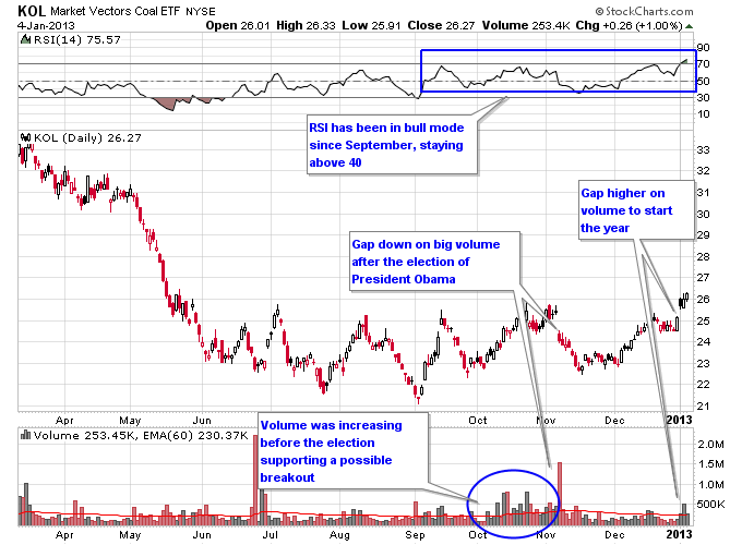
Looking at a daily chart of KOL a couple of things stand out. First, the RSI has consistently stayed above 40 since September, even during pullbacks. This is typically the sign of an emerging uptrend since KOL is failing to get too oversold when it pulls back. Next the action in October was encouraging as volume started to increase as KOL started to approach resistance around the 25-26 area. Things changed quickly though after the re-election of President Obama, which was perceived to be a negative for the coal market. A wave of selling hit the coal sector right after the election and caused a big gap down in KOL. It continued to sell down to about 23, but instead of continuing lower found support there that has held since June 2012. Then KOL started to move higher once again in December. KOL gapped higher to start 2013 and each of the 3 trading days in 2013 have seen above average volume, which is a good sign for a breakout.
Next let's look at some individual coal stocks. Most coal stocks are lacking one key ingredient for a breakout, which is an increase in volume. Just like the KOL ETF, individual coal stocks saw increasing volume in October, but have seen limited buying pressure since the gap down after the presidential election. These stocks need to see buying pressure to overcome the gap down resistance and to transition into sustained uptrends.
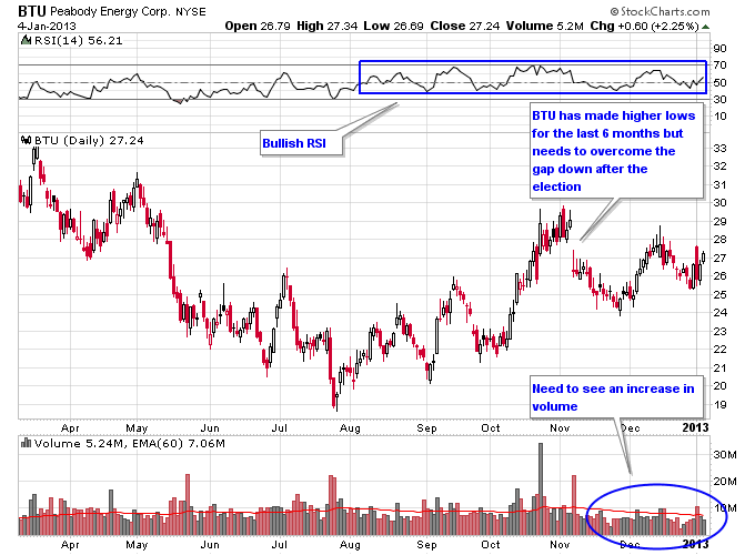
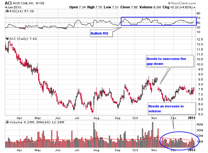
BTU and ACI are two examples of coal stocks below their election gap downs. Both have established a pattern of higher lows and have bullish RSI readings, but need volume to move past their gap down levels.
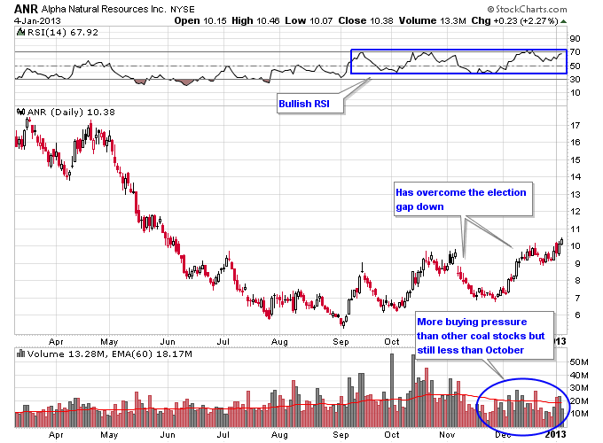
ANR has overcome its gap down from the election, and has seen a little more buying pressure than BTU and ACI.
As 2012 came to a close and during the start of 2013 the market has seen some sectors that were crushed over the past 2 years move substantially higher. This includes solar stocks, steel stocks, and some major commodity producers. The coal sector looks poised to continue rallying but needs more volume to come into the sector, otherwise the chances of the rally continuing are diminished. In particular watch how the sector trades as a whole as time moves forward. The best scenario for a sustained uptrend would be to see increased volume across the board in individual coal stocks as well as the KOL ETF.
Gold And Silver Still Better Off Than Earlier This Year
Even though this summer was a sentiment wasteland for the precious metals markets, right now feels like a close second. After rallying strongly in August and September the metals have declined for almost 3 months now culminating in a recent smash down. And it feels especially worse since the reaction of gold and silver to the open-ended $85 billion per month quantitative easing announcement from Ben Bernanke has been the opposite of what most would expect.
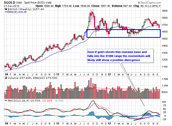
Seeing through the negativity though the situation is better off for the metals than it was 6 months ago. During the summer, gold built a multi-month base in the $1500s which further validated that zone as being a massive support zone. Then the surge higher off of that base has created a big positive divergence in momentum that often precedes a major move higher in price. Even if gold were to drop back into the $1500s, the divergence in momentum should still be in place, and technicians will undoubtedly pick up on that fact if a bunch of demand comes rushing back into the gold market.
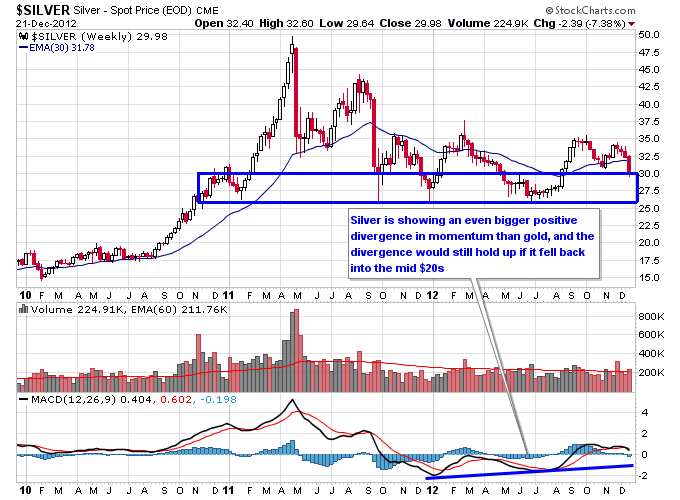
Silver looks similar to gold except the positive divergence in momentum is larger and extends back to the start of 2012. This could be a sign of even more underlying strength in silver than in gold. Notice that just like gold, there's a bunch of hammer candlesticks over the last 2 years once silver breaks below a certain level. This reinforces the supply and demand dynamics at that level (which is about $27.50 on silver) as strong support. Buyers were able to overwhelm sellers repeatedly once those levels were attempted to be breached to the downside for both metals.
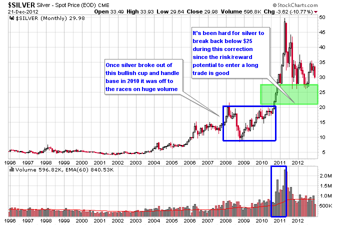
Back in 2011 I postulated that it would be hard for silver to break $25 since the entry point on that trade would be phenomenal for anyone wanting to enter a long term long position in this ongoing secular bull market. The reason was it took silver almost three years to build a base at the $20 level and then it broke out of that base on huge volume. So the closer silver got to $25 the better the risk/reward of the trade for someone wanting to buy a pullback, and have strong support at $20 for downside risk. Since silver is likely still in a secular bull market that would give the trade 20% or so risk to the downside, which is pretty good considering the upside potential could be much higher. So I assumed that $25 would be a good level of support for silver as it entered a new trading range on the correction from $50.
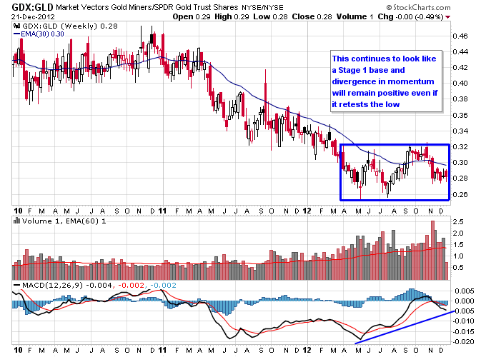
Mining stocks are continuing to demonstrate that they are in the later throes of this ongoing correction in the metals. Back during the summer, almost every mining stock was trading at its lows for the year, or close to them. Now the situation is mixed across the mining space, which indicates some underlying strength. Some mining stocks, such as AEM and FNV, are barely off of recent highs. Others are about at the mid range between their summer low and their September high, such as AUY, HL, and KGC. And some mining stocks have made new lows below their summer lows. Due to more mining stocks holding above their summer lows the GDX to GLD ratio continues to form a Stage 1 base with positive divergence in momentum. And this continues to be significant since major rallies in gold usually are accompanied by out performance by miners.
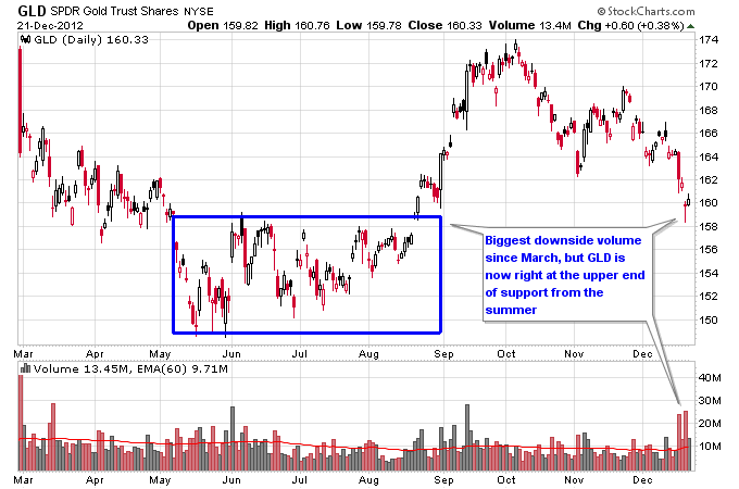
Looking at the short term picture, the trading on December 20th looked like possibly an important turning point or maybe the beginning of one. It was definitely a throw in the towel day for many metals bulls (possibly a lot of weak hands) as both the GLD and SLV ETFs saw the biggest downside volume they've seen since March. But looking at a daily chart, their emotional distress was causing them to dump their positions right at the upper range of support from the summer. And the miners showed some nice strength last Thursday as almost every mining stock performed better than the metals that day. This often happens towards the bottom of pullbacks in the metals as first the miners get dumped early in the correction, then the metals get dumped and the miners show some divergent strength.
The bottom line is there's some short term and long term underlying strength to this recent pullback in the metals. Even if the bears can panic the bulls into selling their positions further into support levels, the bulls still have a positive divergence in momentum that has formed over multiple months and demonstrated long term support at lower levels. It isn't uncommon to see the lower end of a trading range tested one last time before a new rally either.
http://www.nextbigtrade.com/category/technical-analysis/
If gold miners got destroyed in 2013, junior gold miners got taken to the woodshed, obliterated, then eviscerated. You really can't find a more beaten up sector over the past 3 years. You can't find a sector that is more hated, where more pessimism and fear reign supreme. So if you're a contrarian, you should stand up and take notice.
Here's something that you need to understand. Junior gold miners don't always just go down. In fact one of the biggest gains in any sector from its 2008 low to 2011 high was in the junior gold mining sector. The Canadian Venture Exchange gained 256% from its December 2008 bottom to its March 2011 top, a huge gain over a period of 27 months. The GDXJ junior gold ETF came out in late 2009. In 2010 it was one of the best performing ETFs in the market gaining about 67%. From its 2010 low to its 2011 high, a little over a year in duration, GDXJ was up over 100%. So the junior miners have experienced bull markets in the past. There's a saying that bear markets follow bull markets, and bull markets follow bear markets. For a great example of that checkout the history of the Canadian Venture Exchange. The chart below shows the major bear markets shaded in red, and the major bull markets shaded in green. If you notice after the 2008 bear market ended, an increase in buying pressure went on to produce the bull market from 2009-2011. That's what is missing currently as the Venture has built a base but buying pressure still hasn't shown up in full force.

Five Things To Notice While Gold Keeps Drifting

1. If you paid attention to the GDXJ to GDX ratio back in 2011, it gave you a 4-month heads up that something wasn't right in the gold sector. The ratio made a series of lower lows while major gold stocks continued higher, and the price of gold surged higher into a parabolic top. This divergence foretasted the bear market in gold and gold stocks that has followed to this day.
2. But now to the good stuff, first the MACD ratio here is actually trying to hold up and not roll over. It is also challenging the all important zero level, which tends to separate uptrends from downtrends.
3. This is the kind of volume increase you want to see coming off of a bottom. And the pullback since October has been on mostly lower volume.
4. Maybe the most important thing on this chart, this price divergence could be forecasting a new upleg in the gold sector if it holds up, just like the last major divergence forecasted a new major downleg in 2011.
5. I'd like to see this ratio break above the 30-week moving average and see another increase in volume to confirm a real breakout higher.
This is definitely a chart to keep an eye on if you're following the gold sector.
Coal Stocks Grinding Higher
Coal stocks continue to steadily emerge from a brutal bear market over the past 2 years. Last week the coal ETF KOL broke above its 30-week moving average for the first time since early 2012. As you can see on the chart below KOL has been declining below this moving average in a Stage 4 decline since August 2011. If KOL can continue to move higher above the 30-week moving average it will transition into a Stage 2 uptrend.

Looking at a daily chart of KOL a couple of things stand out. First, the RSI has consistently stayed above 40 since September, even during pullbacks. This is typically the sign of an emerging uptrend since KOL is failing to get too oversold when it pulls back. Next the action in October was encouraging as volume started to increase as KOL started to approach resistance around the 25-26 area. Things changed quickly though after the re-election of President Obama, which was perceived to be a negative for the coal market. A wave of selling hit the coal sector right after the election and caused a big gap down in KOL. It continued to sell down to about 23, but instead of continuing lower found support there that has held since June 2012. Then KOL started to move higher once again in December. KOL gapped higher to start 2013 and each of the 3 trading days in 2013 have seen above average volume, which is a good sign for a breakout.

Next let's look at some individual coal stocks. Most coal stocks are lacking one key ingredient for a breakout, which is an increase in volume. Just like the KOL ETF, individual coal stocks saw increasing volume in October, but have seen limited buying pressure since the gap down after the presidential election. These stocks need to see buying pressure to overcome the gap down resistance and to transition into sustained uptrends.
BTU and ACI are two examples of coal stocks below their election gap downs. Both have established a pattern of higher lows and have bullish RSI readings, but need volume to move past their gap down levels.


ANR has overcome its gap down from the election, and has seen a little more buying pressure than BTU and ACI.

As 2012 came to a close and during the start of 2013 the market has seen some sectors that were crushed over the past 2 years move substantially higher. This includes solar stocks, steel stocks, and some major commodity producers. The coal sector looks poised to continue rallying but needs more volume to come into the sector, otherwise the chances of the rally continuing are diminished. In particular watch how the sector trades as a whole as time moves forward. The best scenario for a sustained uptrend would be to see increased volume across the board in individual coal stocks as well as the KOL ETF.
Gold And Silver Still Better Off Than Earlier This Year
Even though this summer was a sentiment wasteland for the precious metals markets, right now feels like a close second. After rallying strongly in August and September the metals have declined for almost 3 months now culminating in a recent smash down. And it feels especially worse since the reaction of gold and silver to the open-ended $85 billion per month quantitative easing announcement from Ben Bernanke has been the opposite of what most would expect.
Seeing through the negativity though the situation is better off for the metals than it was 6 months ago. During the summer, gold built a multi-month base in the $1500s which further validated that zone as being a massive support zone. Then the surge higher off of that base has created a big positive divergence in momentum that often precedes a major move higher in price. Even if gold were to drop back into the $1500s, the divergence in momentum should still be in place, and technicians will undoubtedly pick up on that fact if a bunch of demand comes rushing back into the gold market.

Silver looks similar to gold except the positive divergence in momentum is larger and extends back to the start of 2012. This could be a sign of even more underlying strength in silver than in gold. Notice that just like gold, there's a bunch of hammer candlesticks over the last 2 years once silver breaks below a certain level. This reinforces the supply and demand dynamics at that level (which is about $27.50 on silver) as strong support. Buyers were able to overwhelm sellers repeatedly once those levels were attempted to be breached to the downside for both metals.

Back in 2011 I postulated that it would be hard for silver to break $25 since the entry point on that trade would be phenomenal for anyone wanting to enter a long term long position in this ongoing secular bull market. The reason was it took silver almost three years to build a base at the $20 level and then it broke out of that base on huge volume. So the closer silver got to $25 the better the risk/reward of the trade for someone wanting to buy a pullback, and have strong support at $20 for downside risk. Since silver is likely still in a secular bull market that would give the trade 20% or so risk to the downside, which is pretty good considering the upside potential could be much higher. So I assumed that $25 would be a good level of support for silver as it entered a new trading range on the correction from $50.

Mining stocks are continuing to demonstrate that they are in the later throes of this ongoing correction in the metals. Back during the summer, almost every mining stock was trading at its lows for the year, or close to them. Now the situation is mixed across the mining space, which indicates some underlying strength. Some mining stocks, such as AEM and FNV, are barely off of recent highs. Others are about at the mid range between their summer low and their September high, such as AUY, HL, and KGC. And some mining stocks have made new lows below their summer lows. Due to more mining stocks holding above their summer lows the GDX to GLD ratio continues to form a Stage 1 base with positive divergence in momentum. And this continues to be significant since major rallies in gold usually are accompanied by out performance by miners.

Looking at the short term picture, the trading on December 20th looked like possibly an important turning point or maybe the beginning of one. It was definitely a throw in the towel day for many metals bulls (possibly a lot of weak hands) as both the GLD and SLV ETFs saw the biggest downside volume they've seen since March. But looking at a daily chart, their emotional distress was causing them to dump their positions right at the upper range of support from the summer. And the miners showed some nice strength last Thursday as almost every mining stock performed better than the metals that day. This often happens towards the bottom of pullbacks in the metals as first the miners get dumped early in the correction, then the metals get dumped and the miners show some divergent strength.

The bottom line is there's some short term and long term underlying strength to this recent pullback in the metals. Even if the bears can panic the bulls into selling their positions further into support levels, the bulls still have a positive divergence in momentum that has formed over multiple months and demonstrated long term support at lower levels. It isn't uncommon to see the lower end of a trading range tested one last time before a new rally either.
http://www.nextbigtrade.com/category/technical-analysis/
