Stepping into the world of market analysis can feel a little like walking onto a busy trading floor. You see screens filled with blinking numbers, dynamic lines moving across a grid, and colourful bars shifting as prices change. For anyone starting out, it’s easy to feel overwhelmed by the visual complexity of it all. Once you know what to look for, however, reading price movement is often less complicated than it first appears.
One of the most practical steps you can take is learning how to navigate TradingView charts, which provide a flexible, user-friendly way to track assets and observe how markets behave over time. By learning what the chart is showing and developing a consistent way to interpret that information, you can approach market data with much greater clarity.
If you’re just starting to use TradingView for market analysis, this guide will show you how to approach the chart in a more structured and purposeful manner.
Start With the Market, Time Frame, and Bigger Picture
Before diving into individual “candles” or indicators, it helps to pause and establish what you’re actually looking at. Every chart tells a specific story, and that story changes depending on your vantage point.
When you first open a chart, take note of the instrument and exchange you’re viewing so you know exactly which market the price data represents. Next, check the time frame. Are you looking at price changes over five-minute intervals or observing how the asset has behaved from week to week? Doing this first can help you see the broader direction without getting distracted by short-term noise. If a weekly chart shows a sustained downtrend, for example, a brief upward move on a five-minute chart looks quite different when viewed in a wider context.
That bigger-picture perspective gives you a useful reference point before you begin interpreting individual price movements. Instead of reacting to whatever is happening in the latest few candles, you can consider where the current price sits within the broader movement unfolding on the chart.
Read Candlesticks as Price Behaviour
Once the broader context is clear, you can zoom in on how price actually moves during a specific period. Rather than treating candlesticks as a dry glossary of terms, it helps to view them as a visual record of the ongoing tug-of-war between buyers and sellers.
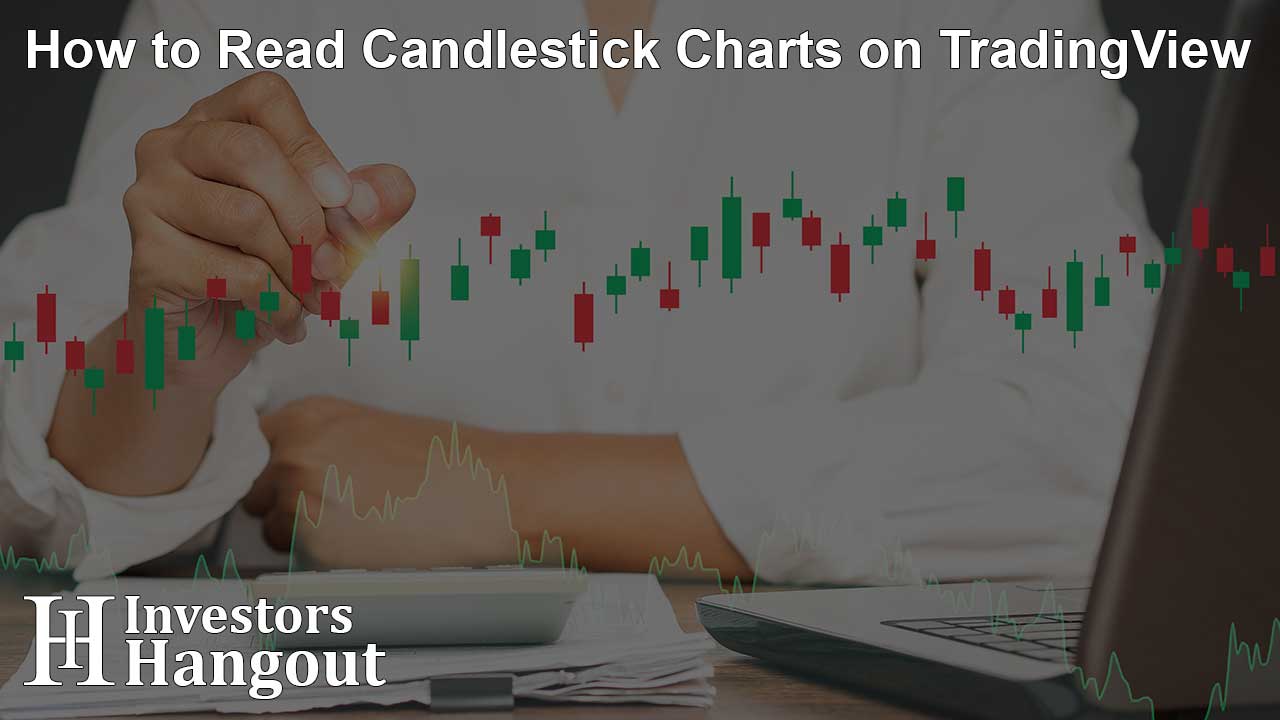
Each candle has a central body and thin lines, or wicks, extending above or below it. The body shows where the price opened and closed during that interval, while the wicks mark the highest and lowest prices reached. Read together, these elements can reveal how strongly buyers or sellers were able to influence price. Is there a long upper wick? It may indicate that buyers pushed price higher before sellers stepped in and drove it back down before the close, which can be a sign of rejection. Meanwhile, a series of larger candle bodies moving in the same direction can suggest stronger buying or selling pressure.
Observing how these shapes unfold gives you a clearer sense of that pressure, showing you not just where the price landed, but how the battle played out along the way.
Use Market Structure to Identify Trends and Key Price Areas
With a sense of price behaviour under your belt, you can start mapping out the broader market structure. This is where trend analysis and key levels come together, because both rely on reading how price behaves across the chart over time.
An uptrend typically reveals itself through a series of higher highs and higher lows, showing that buyers are gradually willing to pay more. A downtrend, on the other hand, tends to form lower highs and lower lows. Nevertheless, prices don’t move in straight lines. They stall, bounce, and reverse around certain zones, often creating areas of support and resistance that traders watch closely. The market structure tells you the general direction, while key levels show you where that trend may be tested or where buying or selling pressure could re-emerge.
Drawing horizontal lines across previous turning points helps highlight areas where buying or selling pressure has appeared before, giving you useful reference points for assessing how price behaves when it approaches those areas again.
Read Volume and Indicators as Supporting Evidence
It’s tempting to pile on indicator after indicator in search of a clearer answer, but a cleaner approach is to treat these tools as supporting evidence. Price remains the main story, while volume and technical indicators provide extra context that can strengthen or challenge what you’re seeing on the chart.
Volume shows how much of an asset is traded during a given period. If price pushes past a key resistance level alongside noticeably higher volume, that move may carry more weight than something that occurs during relatively quiet trading. Other tools, such as moving averages or momentum oscillators, can add another layer of perspective, although they’re most useful when read alongside price action rather than in isolation.
More importantly, avoid stacking several indicators that essentially measure the same thing. Doing so can clutter the chart and make the analysis harder to interpret instead of more informative.
Bring the Signals Together Before Forming a Market View
Reading a TradingView chart ultimately comes down to synthesis rather than ticking off isolated boxes. The signals you see will not always point neatly in the same direction, so learning how to weigh them together is an important part of building a balanced interpretation.
Just as importantly, ask yourself what price action would challenge your current view. Keeping that question in mind can help you stay flexible as conditions change, treating the chart as a source of evidence rather than a guarantee of what comes next. Finally, remember that TradingView charts—or any other chart, for that matter—is an analysis tool and that your interpretation does not guarantee future price movements.